

Let’s start with a little background on what TPO charts, and where the letters and numbers came from that make up the TPO Profile charts. On the trading floor, when the traders were in the pit and they had a trading card, each half-hour was called a bracket and when they traded, they would have to write down the letter of the bracket that the trade occurred in. So, each letter was very specific to a half-hour time frame and that's how the letters became the building blocks for the TPO charts.
TPO charts are the same as Market Profile charts and you might hear both terms thrown around among traders; Market Profile or TPO charts. TPO stands for time price opportunity. Each letter would be a TPO and the way these are built is, as price trades it prints a TPO. Each bracket is a half-hour that it represents. As the market moves up and down there is a distribution of the TPO lines. One of the key things that traders utilize and benefit from by looking at a TPO chart, is that it helps you look at how a market is backing and filling, trading up and down, and where it tends to revert to. It provides a unique view of the market, whereas a candlestick chart looks at them horizontally over time as 30-minute bars. But if you were to compress these and just stack them all up, that's what you end up having on the TPO chart.
If you've ever heard the term Auction Market Theory, TPO charts are what it really represents, the auction. When you hear auction market theory, you should probably think of TPO charts because the whole idea is that it's helping you understand the auction and see how the price is running up and down and backing and filling and creating a profile and each profile will look different, they're not necessarily the same each day. You see it developing a fat or wider part of the profile and that simply represents the area that it spent more time in. Another term is Market Generated Information and really everything you see on a chart is market generated information. But market-generated information goes hand in hand with auction market theory and what we're trying to do when we look at a TPO profile is understand the auction that's taking place and there are strategies then that you can employ to trade the market using this information.
TPO Profile charts are based on time that builds a graphic based on 30-minute brackets and it builds a distribution over time showing you what the market is doing. Where does it tend to constantly be backing and filling areas where you have fewer TPOs? You can use all of this information to build trading strategies.
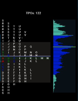
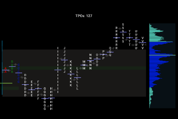
The traditional way to look at these charts is to split them apart where you see each 30-minute period bracket filling throughout the day horizontally.
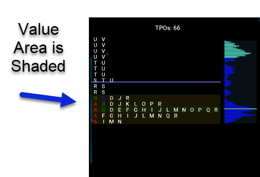
But if we merge the profile by removing the splits, it stacks them all up so that we can see where it spent less time and then where it has spent more time, the thicker price area is, is where it has spent more time during the day.
TPO profile represents how time was built throughout the day, at each price. So, to say it again, each bracket represents a half-hour period of time and shows the price range using the specific letter designated for that bracket.
There are also a couple of other components that go into TPO Profile charts and one of them is called the Value Area. The value area represents where 70% of the day's trading volume took place. Point of Control (POC) is the price point where the price spent the most time trading.
TPO Profile Charts can be used as a compass to help give you an idea of market direction. It can be one of the tools you use to help you analyze the markets. You need to decide if you are looking for longs or shorts? Does the market have the potential to move in one direction or the other?
Does the market have built up energy to move vertically versus the tendency to rotate and become more range-bound? There are some useful ways to apply TPO Charts to aid you in that manner. They can help you build the narrative for the day both pre-market, during the day, and then post market when you’re doing your debrief.
Want to Learn More About TPO Profile Charts?
Discover how futures traders use TPO Profile charts to identify trading opportunities. TPO charts allow the user to analyze the amount of trading activity, based on time for each level the market traded at, for any given period of time. This allows you to easily see the areas where the market is trading most of the time and helps you analyze price, volume, and time in a single chart.
Find Trading Opportunities Using TPO Profile Charts
Identify Trade Setups, Profit Targets & Trading Strategies Using TPO Profile Charts